ABOUT THIS PROJECT
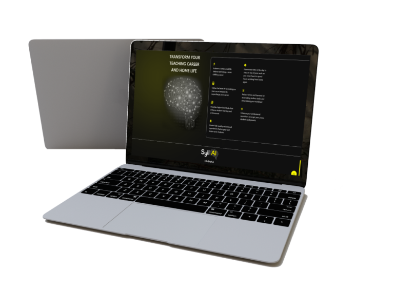
Syll.ai approached Spadasoft since they were facing challenges in UI/ UX, which was affecting the overall effectiveness of the platform.
OUR INVOLVEMENT
Development
Design
TECHNOLOGIES USED
CSS
Javascript
Syll.ai is the #1 platform offering comprehensive AI tailored solution for their teachers
Syll.ai is a platform made for educators to help ease their burden of time-consuming administrative tasks. This AI platform is created for the teachers and helps them in tasks such as grading, giving feedback to their students, creating lesson plans, and managing learning materials.
Syll.ai lets users upload and create files that help people for training and helps them meet their unique educational needs. This platform aims to save users time and provide them with a quality education that helps boost their efficiency and happiness.


Spadasoft’s role and involvement in the UI/ UX of Syll.ai
Spadasoft aimed at solving the UI/ UX issues that were hindering the overall effectiveness of the platform. We redesigned their platform to enhance their user experience and to improve their website’s key functionalities. Our process included automating an intuitive system with smart algorithms. Due to the user-friendly interface we created, they received a face-lift in their lesson planning techniques.
We created drag-and-drop features and a visual timeline to optimize the search and categorization capabilities. With their smooth user interface, they experienced reduced time spent on grading and providing feedback and created a personalized interaction of teachers with the students. They became the leading and most efficient solution in education technology.

DURING THE PROJECT
For this revamp, we leveraged our own PDP (Product Design Process). Recognizing the significance of a structured and user-centric approach, we started this project with a clear roadmap in place.
Throughout the process, regular feedback loops and iterations ensured that we stayed aligned and incorporated necessary fixes along the way.
FOUR STAGES
Research
Ideation
Execution
Technical Assessment
First, we gather evidence that will support the decisions taken henceforth, ensuring that no decision is made based on vague assumptions.
This stage consists of 3 steps: a briefing with the project’s vision and goals and business requirements; user research to guarantee product usefulness and effectiveness from the user’s perspective; and a design benchmark to analyze the landscape of similar and complementary products, design patterns and technologies used in the industry.
The Research stage allows us to leverage the knowledge and skills of existing players and ensure features and design differentiation in the market, and ensure costumer fit.
We formulate an approach to the product based on the user’s needs and the business model.
This is the core of the creative process and it is where the concept of the product is formulated based on the user’s needs and the business model (both identified in the Research phase). Here, the UX designer, the product designer, and the product owner work closely together.
This stage consists of 4 steps: mapping out the user journey, by describing each user’s action, with various user scenarios; a decision matrix that helps prioritize the users’ and product’s goals while considering the product life cycle’s current stage; drawing the wireframes, i.e., the pages’ structure and navigation flow to ensure interface usability and reduce design time; and finally, a mood board to ensure that the product’s look and feel conveys the desired user experience and is aligned with the user profile and market strategy.
We bring the concept to life and put it into practice.
In this stage, the product designer focuses on creating a physical representation of the concept that has been defined up to this point.
It consists of 3 steps: a style guide, where we define a graphic interface’s style, considering colour palette, fonts, image style, input fields, buttons, and so on, to ensure consistency throughout the application; a graphic user interface design (GUI) which are the end-looking screens by applying the style guide to the wireframes; and a click-through prototype to facilitate the feedback from stakeholders or potential users and investors.
We guarantee that all requirements and ideas generated are realistic to implement.
In this stage, all the work previously done should be achievable considering the available time and budget previously settled.
It consists of 2 steps: a high-level architecture where we detail how the product will be built, identifying baselines for the needed technologies and skills to make it; and a project plan to define the major milestones and provides a general understanding of the project’s structure, phases, intersections and interdependencies.
TECHNOLOGIES USED
CSS
We used CSS to create interactive designs on their website for their users. We successfully did their website’s padding, margins, borders, etc.
JAVAscRIPT
Javascript enabled our UI UX designers to create prototypes for their websites directly in HTML and CSS. Thus, it helped us create their smooth and efficient user interface.

WORKING MODEL AND TEAM
While the initial website revamp brought significant improvements, it’s important to mention that digital landscapes are constantly evolving. The dynamic nature of user preferences, technological advancements, and market trends needs continuous monitoring and adaptation. By consistently analyzing data and gathering user feedback, we ensure that our website remains responsive, engaging, and aligned with the evolving needs of the modern users. This ongoing commitment allows us to deliver an exceptional online experience and stay ahead in a competitive digital world.
KEY RESULTS
This project delivered an in-depth understanding of the customer persona
and their interaction with the service.
40%
Active users after completing the UI / UX Audit
35%
Improvement in feedback
30%
Decrease in user drop-off rates

